Dazed and Confused
Brief
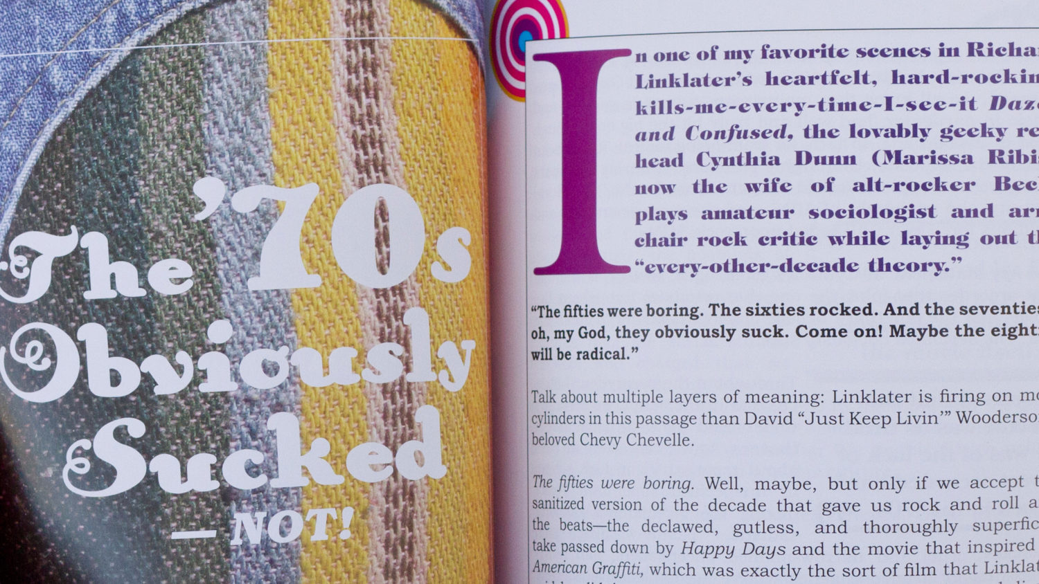
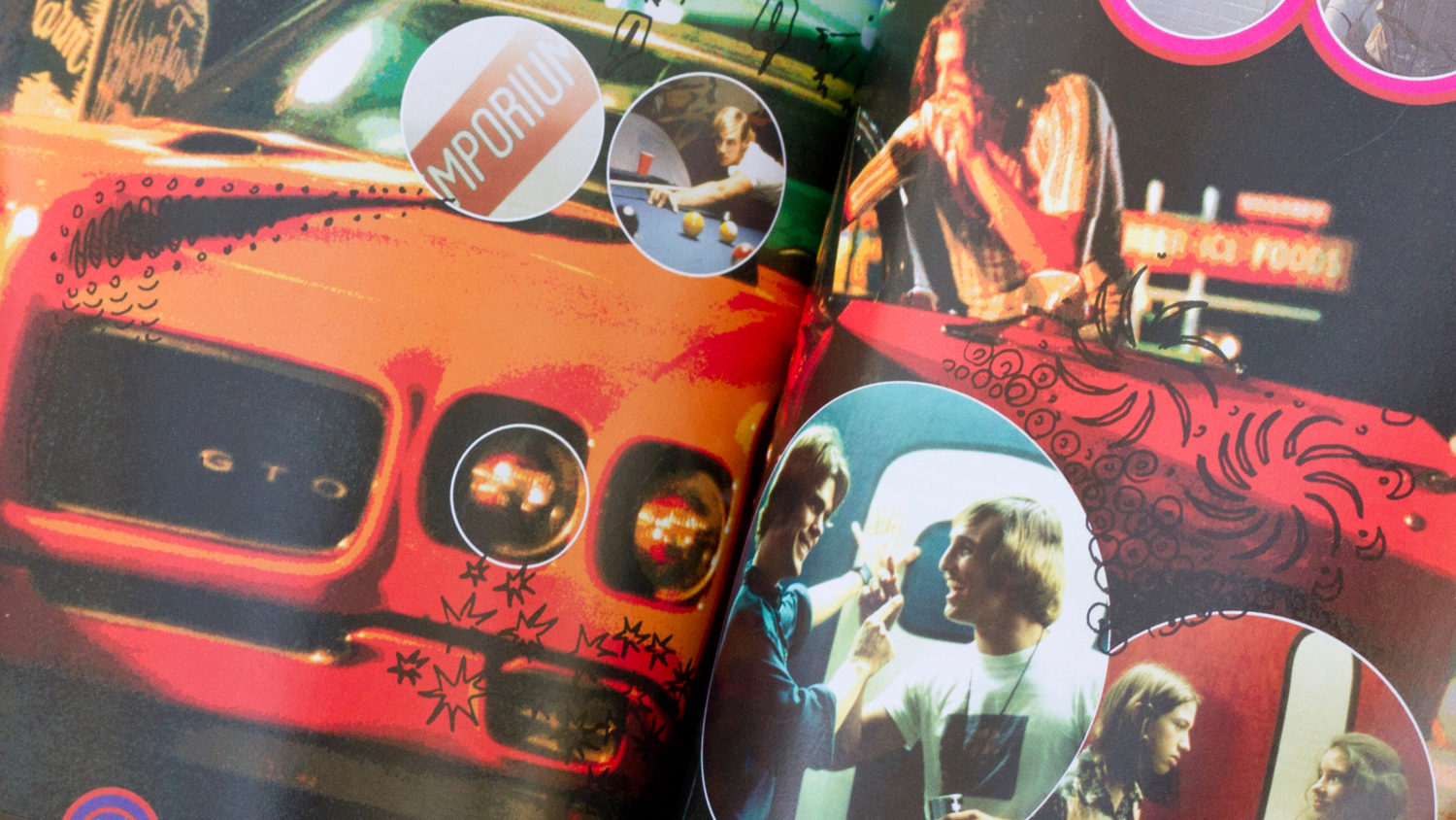
America, 1976. The last day of school. Bongs blaze, bell bottoms ring, and rock and roll rocks; this is the setting for Richard Linklater's ultimate teen film, Dazed and Confused. We were tasked with bringing the spirit of '76 back to life for the film's DVD packaging and menu design for The Criterion Collection.
Solution
Staying far away from the tie-dye and smiley face 70's clichés, we wanted to stay true to the movie's story; bored teens worried about everything else but school.
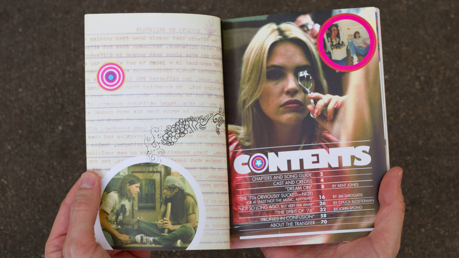
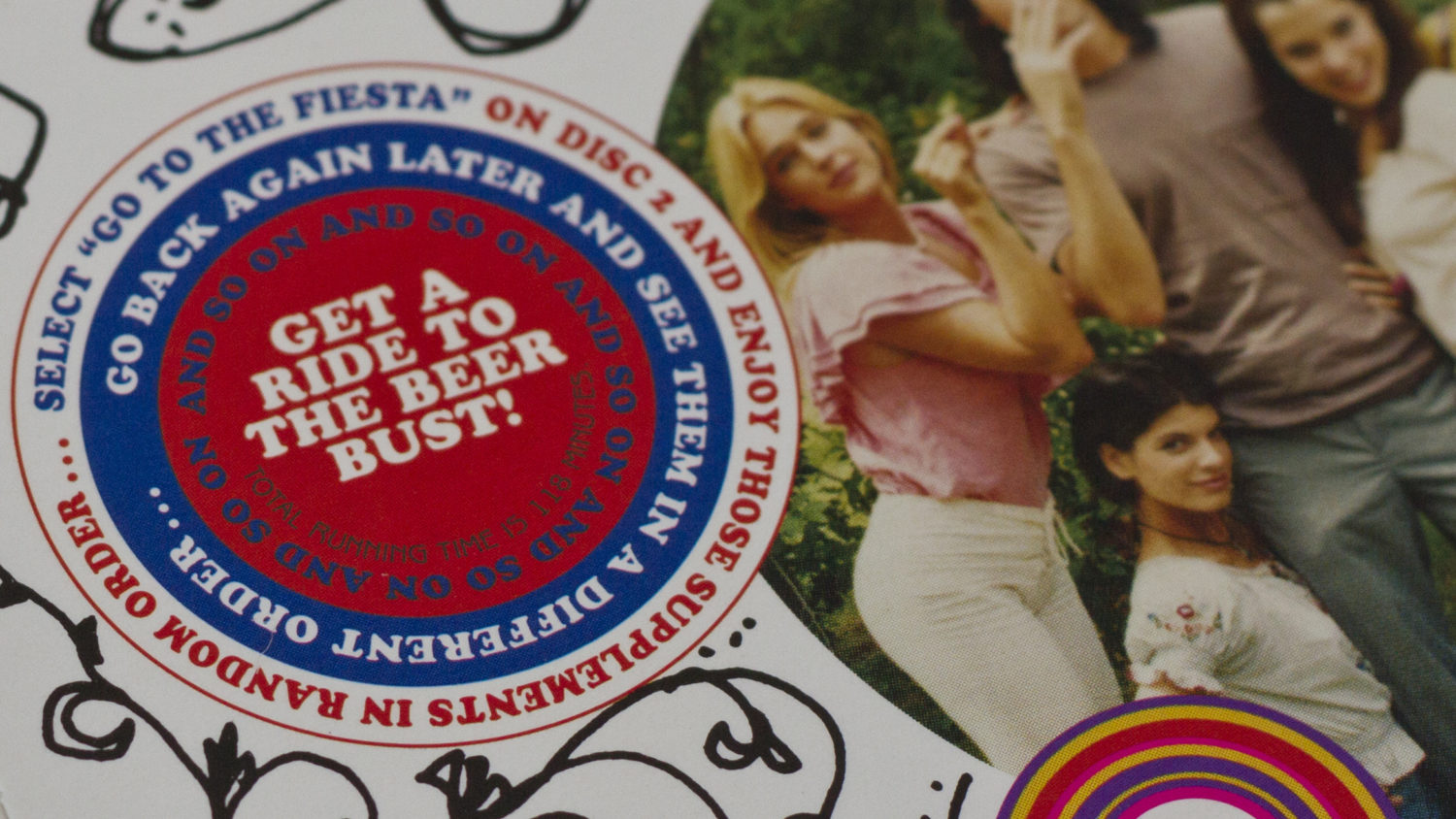
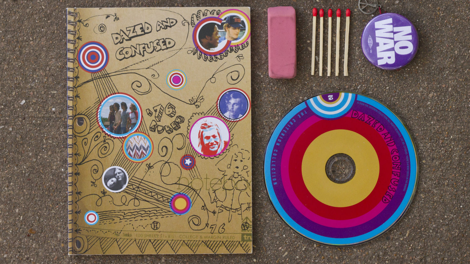
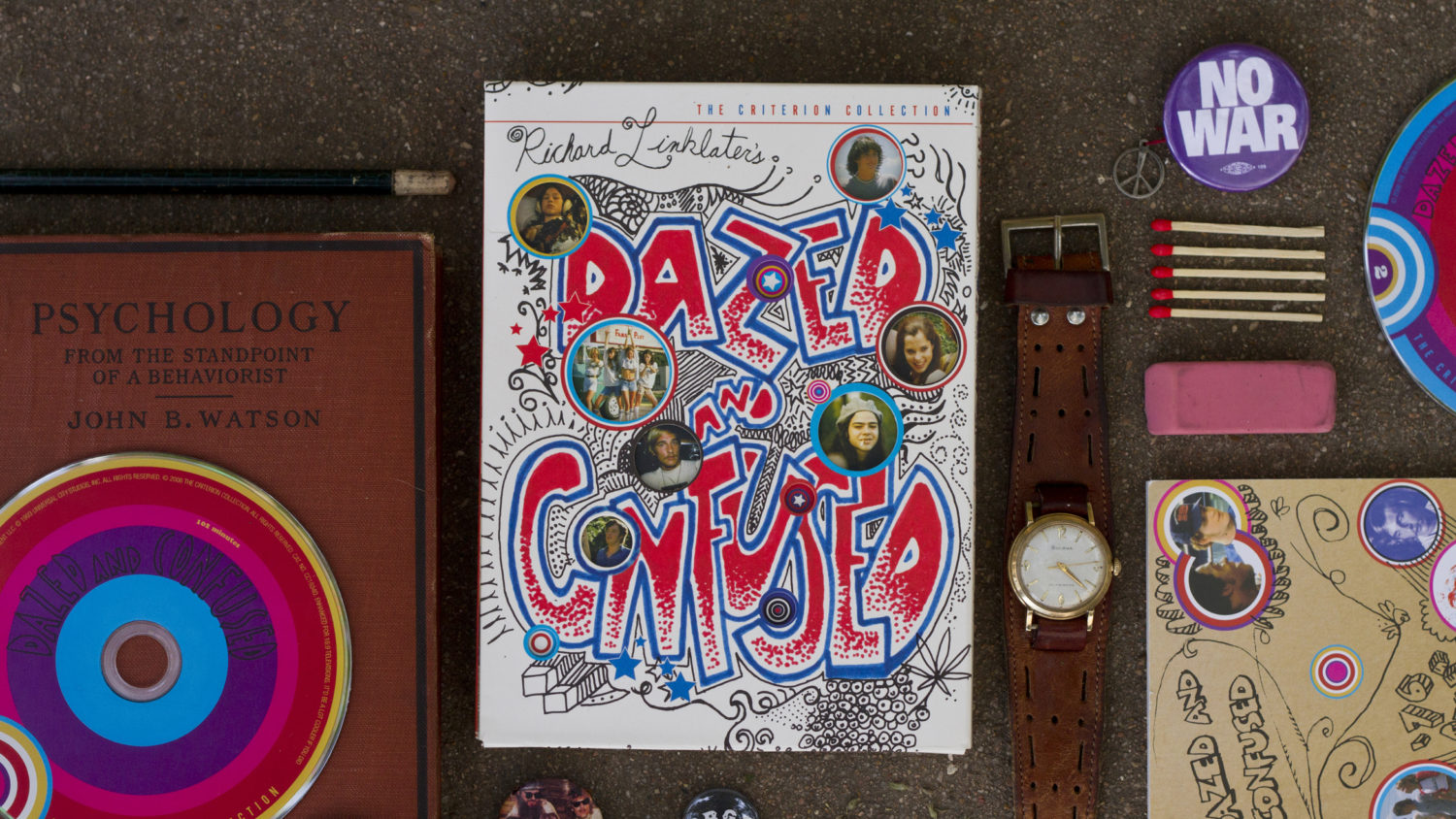
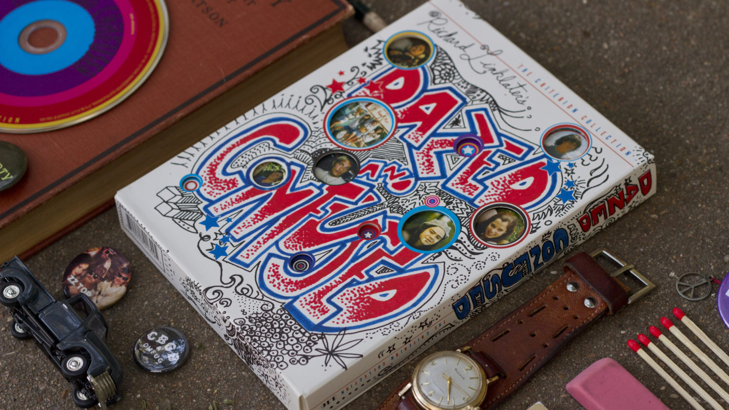
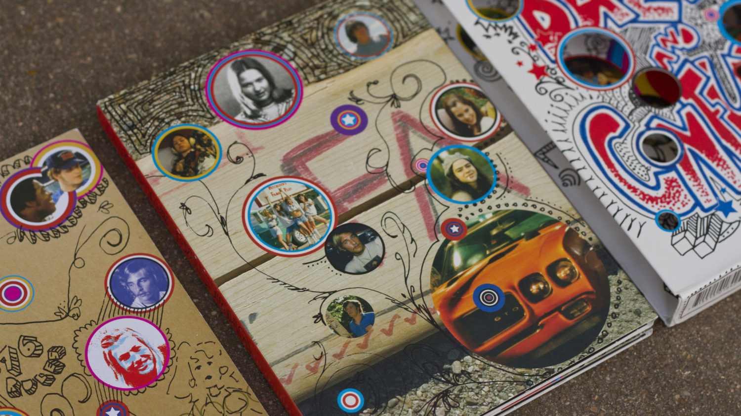
The work features doodles you'd see on countless notebooks, text books, and love notes. From the period specific typefaces and imagery styling to the actual clothing and props from the movie being used to adorn the packaging and menu titles. We went for authenticity over any type of "theme."
Credits
Creative Director – Marc English
Design – Joshua Kramer, Beth Stone
Work done while employed at Marc English Design
Inspiration
“Been dazed and confused for so long it's not true.”
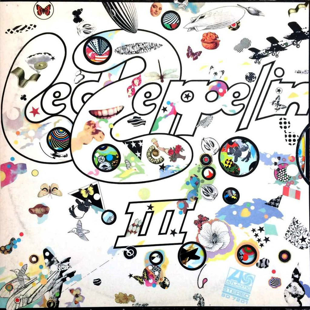
Led Zeppelin III's original vinyl edition was packaged in a gatefold sleeve with an innovative cover designed by Zacron. The cover and interior gatefold art consisted of a surreal collection of seemingly random images on a white background. Behind the front cover was a rotatable laminated card disc, or volvelle, covered with more images, including photos of the band members, which showed through holes.
Because Criterion's fan base always has high expectations surrounding every movie release, we thought Zacron's design served as the perfect inspiration for this particular digipack. Released in 1970, Led Zeppelin III would most definitely be sitting on the shelf of any of the characters featured in the film. With strategically placed die-cut holes, the images showing through would change depending on how you had the DVD case and booklet inside the sleeve.
